|
GlobeInt.com, Inc. Your Internet Marketing Solutions Center |
Call Us: 603-448-2110 Schedule Appointment sales@globeint.com |
|||||||
|
|||||||||
Home :: Website Services :: Special Services :: Responsive Web Design
| Observation Report | SEO & SEM | Responsive Design | Content Marketing | A/B Testing | Landing Pages | Website Analytics |
Responsive Web Design (RWD)
The sites with RWD provide an ideal viewing environment which allows for ease of reading and navigation of the website without having to scroll or resize in order to view the entire site. RWD is efficient because the web developer does not have to spend time to conform the site to individual devices. There is an increase of "smart devices" on the market today including mobile devices, watches, cars, and eyeglasses. Smart devices are being developed rapidly and will increase over time. RWD makes sense in today's web design market so your site will conform to most any device which exists today and in the future. The RWD approach is considered a fluid concept. Your website needs to flow into whatever container is being used. RWD starts with creating a layout to emphasize the most important content on your website. We will work with you in the RWD process to determine the best content to be accessed in an effective manner on smaller screens. RWD is in its early stages and will evolve & progress in time. RWD is a very important web design concept for all businesses on the internet to be readable by any "smart" device. The RWD concept is now considered an essential part of the web design process and must be accounted for in order to have a successful internet web presence. |
|
GlobeInt.com, Inc. 3 High St. Lebanon, NH 03766 Local: 603-448-2110 sales@globeint.com |
Resources FAQ Center Data Center Glossary Control Panel Online Manual Webmail |
Portfolio About Us Policies Contact Us Employment Reseller Services |
||
| © Copyright 1999-26, GlobeInt.com, Inc. All rights reserved. | ||||
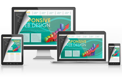
 RWD is a method that is part of the initial web design to allow easy reading of the website on any size device - Tablet, IPAD, Smart Phone and large Desktop monitor.